Anatomy Gyms
Born from a bold vision to create a gym that would redefine the fitness experience.
With a mission to build a space where culture thrives without the ego.

Anatomy Gyms deliver results-driven functional fitness for lifelong health, all within a welcoming environment where community is at the heart of everything they do.
Approaching their 10-year anniversary, Anatomy wanted a new identity to reflect the legacy they were building and the future aspirations of becoming a multi-gym brand.
-
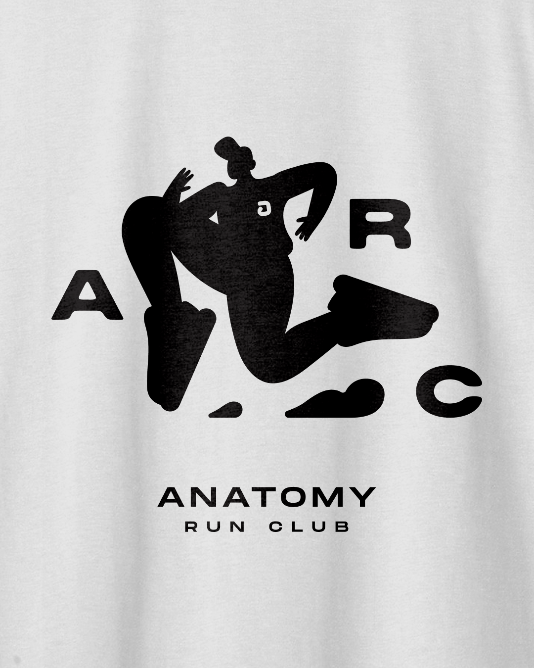
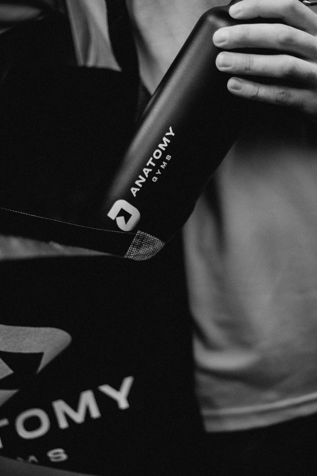
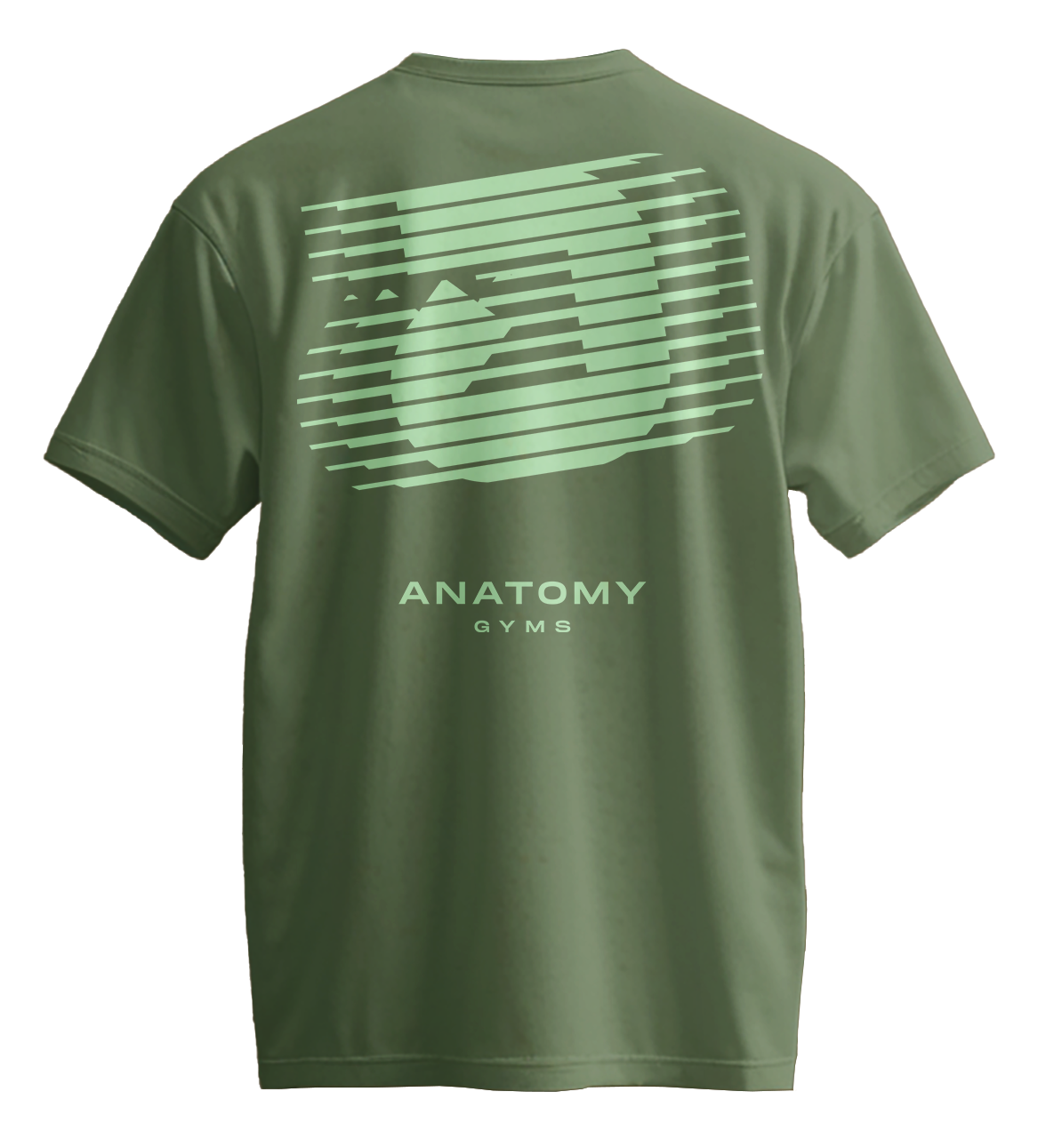
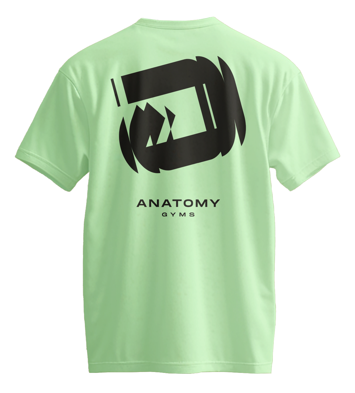
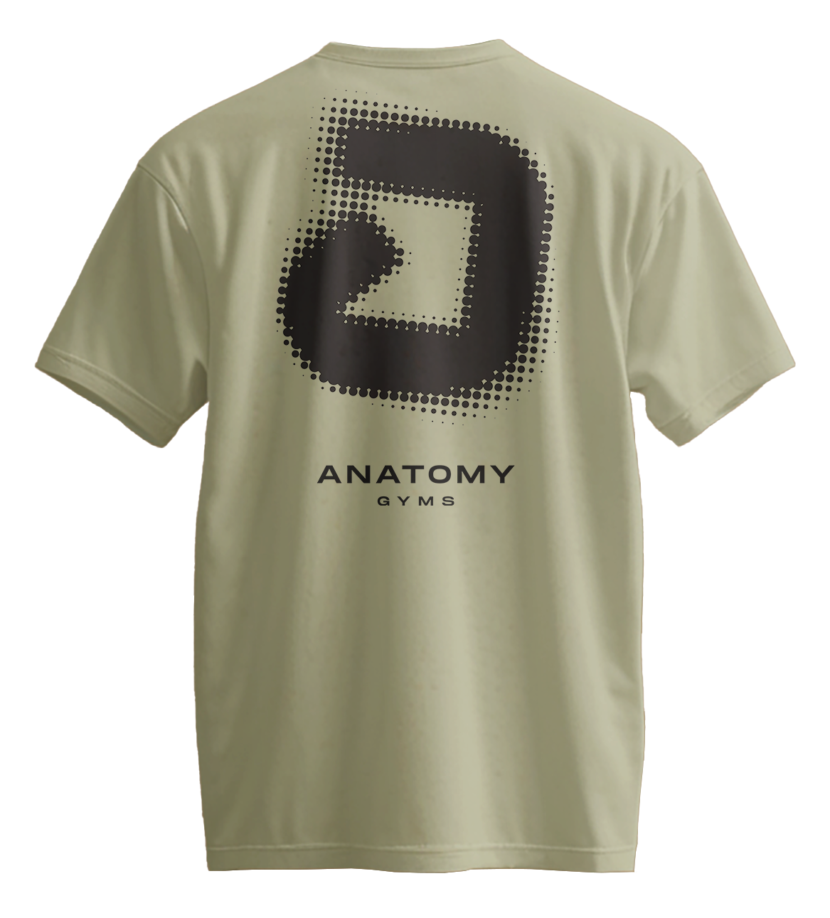
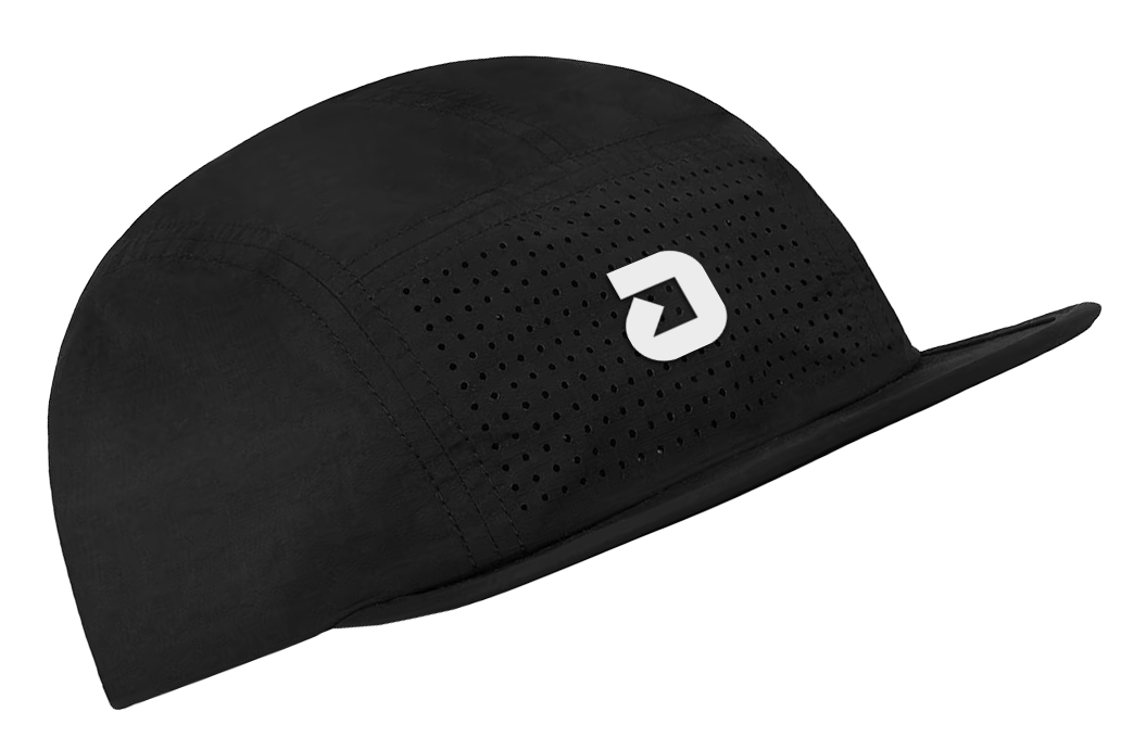
Creation of a new brand identity for Anatomy Gyms, including logo, colour palette, typography, iconography, merchandise and t-shirt design.
Born from
Adam (Founder of Anatomy Gyms), is a Master Kettlebell Instructor; teaching internationally and leading workshops and certifications across the globe.
Kettlebells are therefore a staple tool within the strength and conditioning classes at Anatomy. I wanted the logo to be born from this idea; something that was so integral to both the inception and future of Anatomy Gyms.
the kettlebell

Understanding
the difference
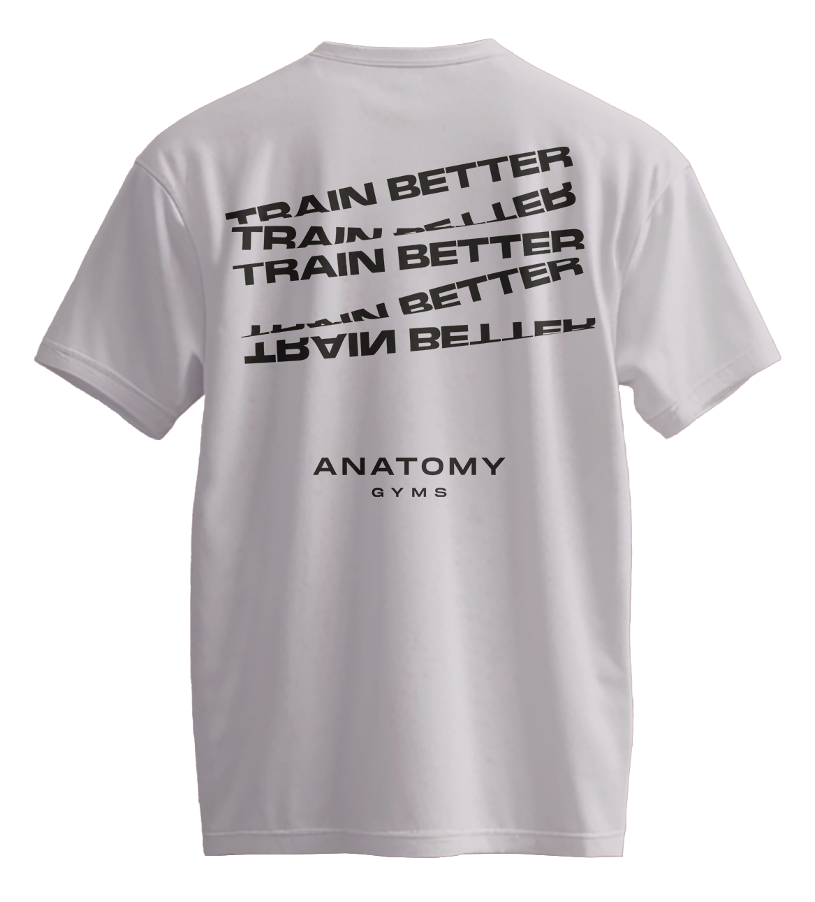
At Anatomy, fitness isn’t about punishment – it’s about measurable progress. Their approach focuses on smarter, more functional training designed to support lifelong movement, balance, and strength. Every workout is intentional, every plan is personal, and every goal is grounded in long-term health – not quick fixes or burnout.
This is where training better replaces training harder.
The visual identity strikes a balance between precision and warmth – a functional aesthetic built on clean lines, purposeful design and clarity of form.

A grounded, versatile palette with soft, warm tones and contrasting greens for rich and energetic brand expression.
The result is a visual language that feels both capable and caring. Professional without being cold. Approachable without losing its sense of purpose.


A gym brand with
a cultural outlook.